
Tunki-Tunki — Building a Playful Visual World Around Plant-Based Dips
Product photography • Lifestyle • Social campaign imagery
This project explores how bold color, texture and food styling can be used to build a vibrant visual language around a product.
Tunki-Tunki’s plant-based dips have a strong personality expressed through their playful branding and vivid packaging. The creative direction for this series was developed to echo that spirit by creating energetic, colorful scenes that feel both graphic and appetizing.
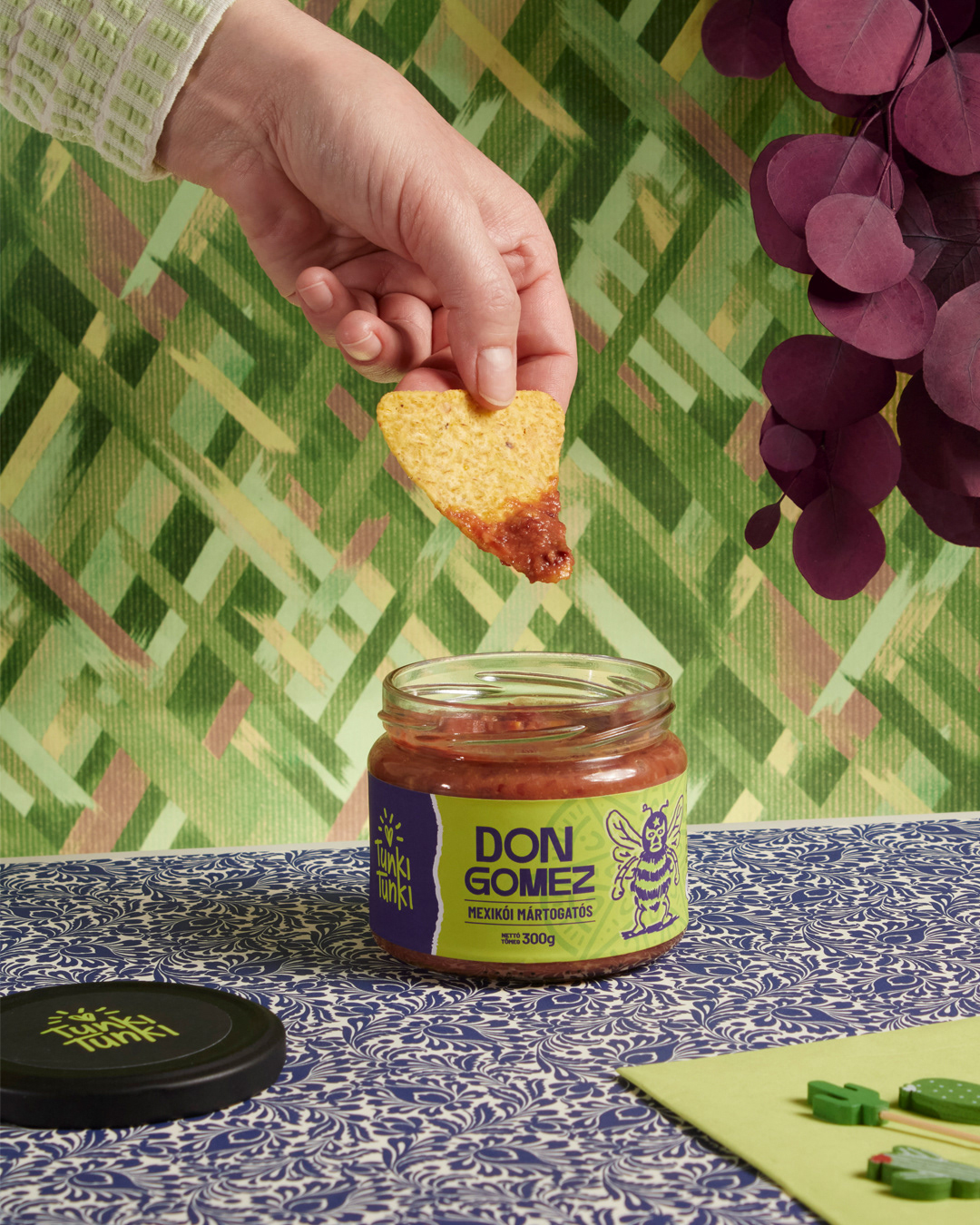
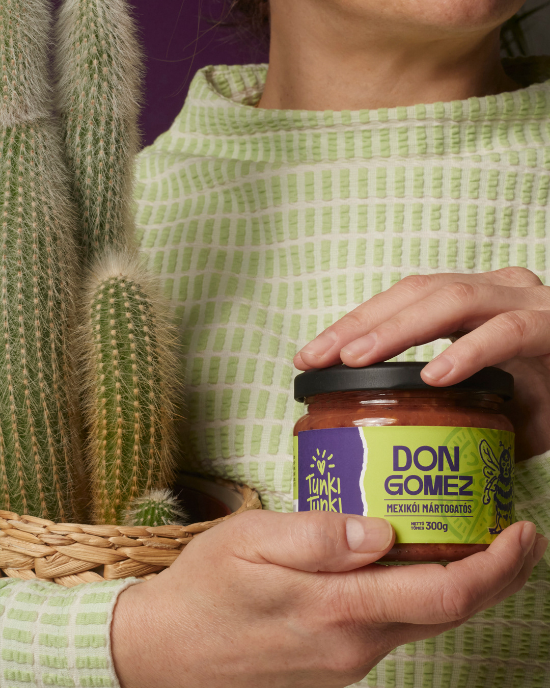
Rather than focusing only on traditional product photography, the concept was to create a set of images that show the product in different contexts: from clean product portraits to moments of interaction and food application. The goal was to demonstrate how the dips can live naturally within everyday food experiences.
The visual direction combines several elements:
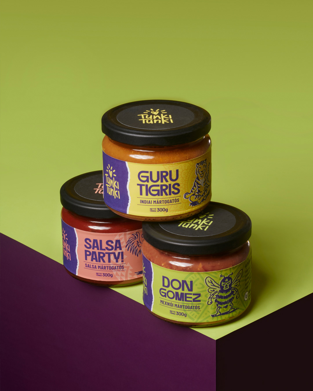
– Bold color palettes inspired by the packaging
– Graphic backgrounds and textures that reinforce the playful tone of the brand
– Human interaction through the dipping moment
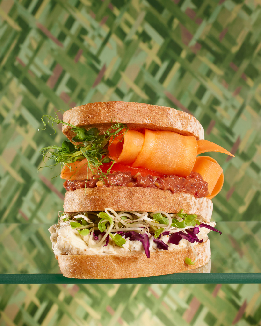
– Food styling that shows the product used in recipes, such as sandwiches and snacks
– Bold color palettes inspired by the packaging
– Graphic backgrounds and textures that reinforce the playful tone of the brand
– Human interaction through the dipping moment
– Food styling that shows the product used in recipes, such as sandwiches and snacks
By moving between these visual layers, the series creates a cohesive narrative where the product is both the hero and part of a broader food story.
The final images were designed to function across multiple brand touchpoints, from social media and digital campaigns to editorial-style storytelling.
Through this approach, the project demonstrates how thoughtful styling, color direction and composition can help transform a simple food product into a lively and recognizable visual universe.